Practical field guide

Learning

Accessibility starts before the PDF is exported.

Access Lens AI screens PDFs after export. This learning library focuses on the upstream decisions that help document creators send cleaner structure, reading order, metadata, and image descriptions into the PDF in the first place.

First collection

InDesign accessibility basics

Six practical fixes inside InDesign that can improve the structure, reading order, metadata, and accessibility signals carried into exported PDFs.

Paragraph Styles / Export Tagging

Turn visual headings into real structure.
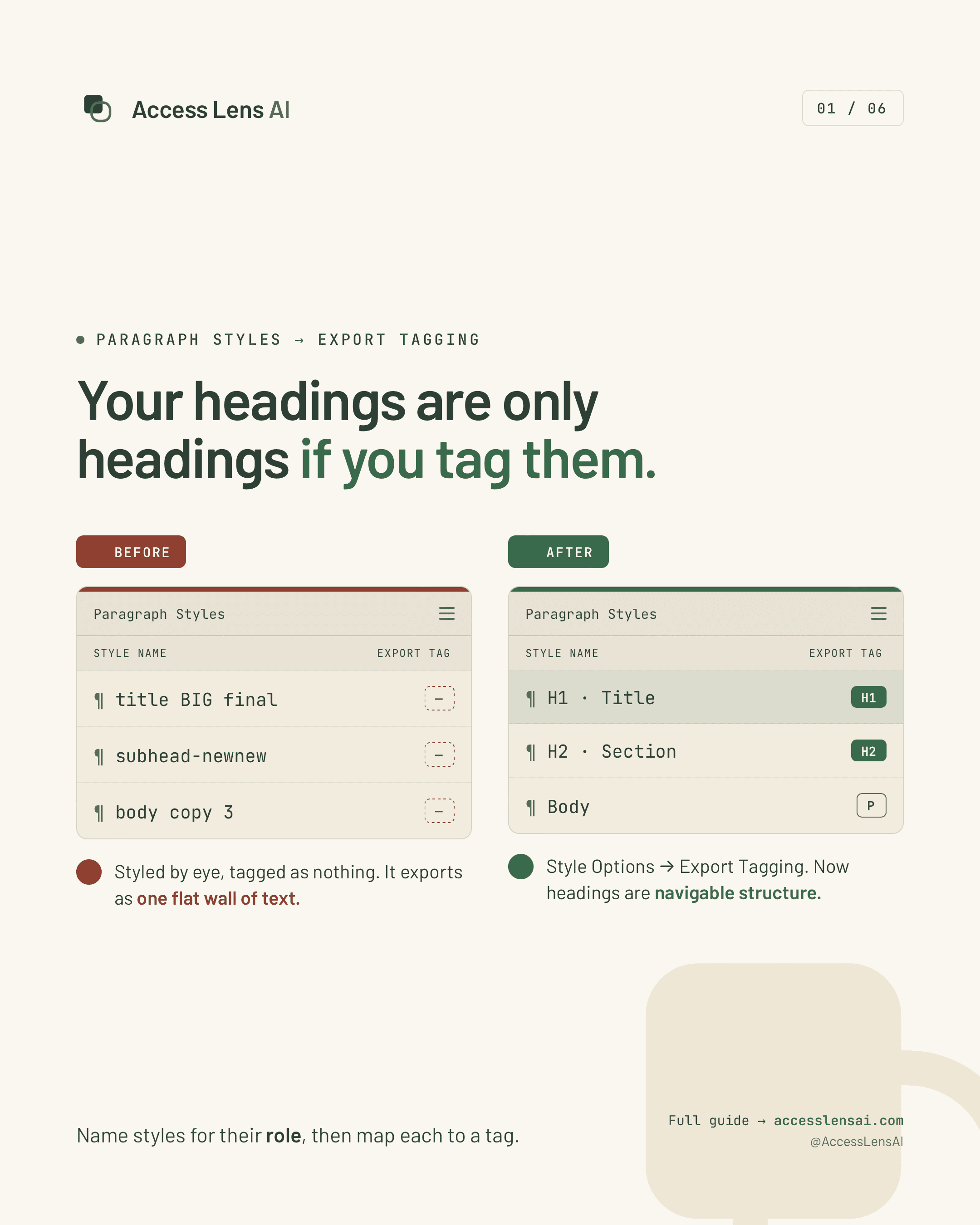
Before-and-after poster showing InDesign paragraph styles without export tags compared with styles mapped to H1, H2, and paragraph tags.

Paragraph styles become useful to exported PDFs when each style is mapped to the role it should carry.

Why it matters

A styled headline that exports as plain text removes the outline people use to scan and navigate.

What to check in InDesign

Open Paragraph Styles, review Style Options, and map headings, body text, and lists to the right export tags.
Learn the fix

Articles Panel / Reading Order

Decide the reading order before export.

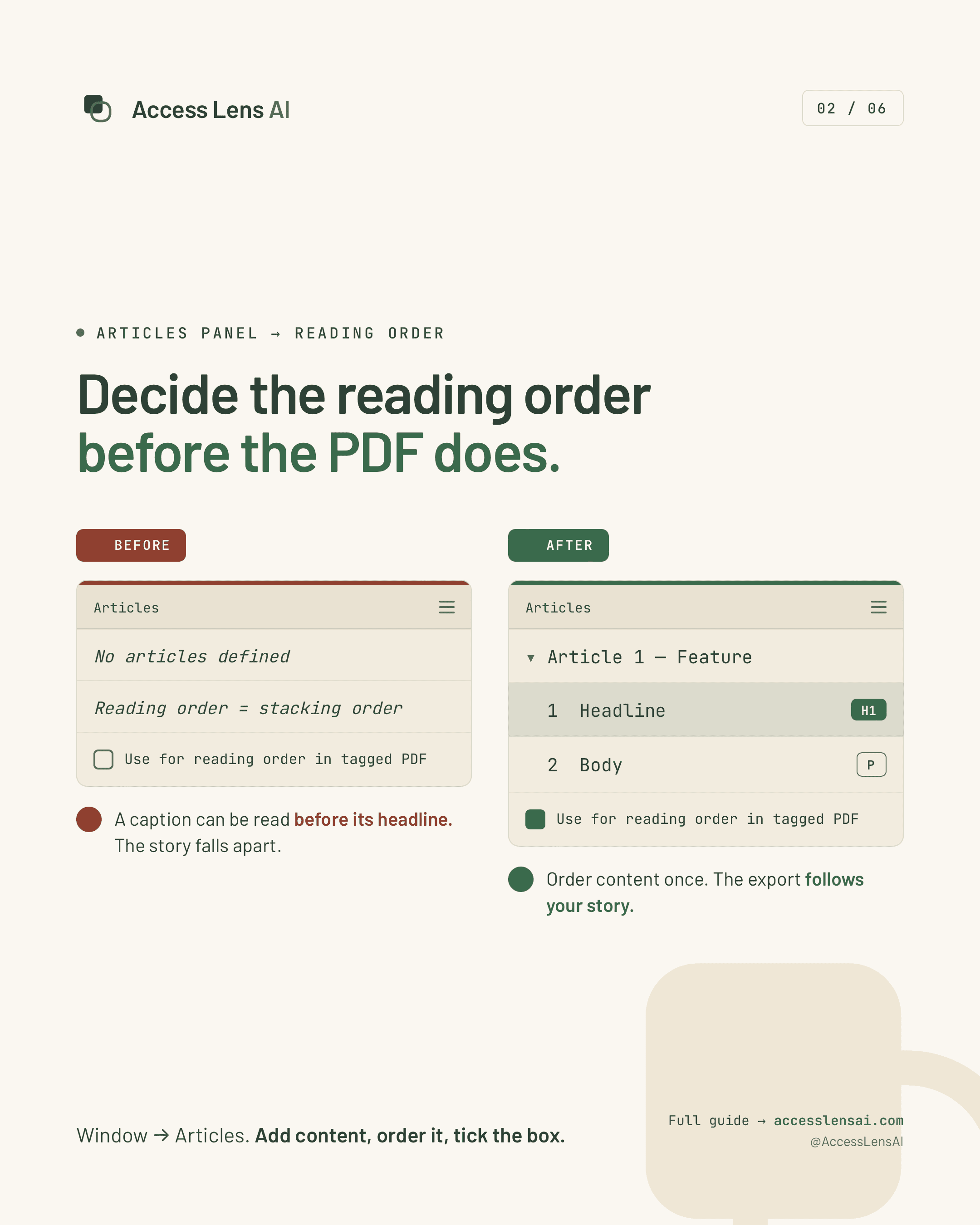
Before-and-after poster showing no InDesign articles defined versus an article with headline and body content ordered for tagged PDF reading order.

The Articles panel lets teams define the story sequence instead of relying on the visual stacking order.

Why it matters

A caption, sidebar, or pull quote can be announced before the content it explains when order is left implicit.

What to check in InDesign

Open Window, Articles, add content in the intended sequence, and enable that order for tagged PDF export.

Learn the fix

Alt Text / Object Export Options

Every meaningful image needs words.

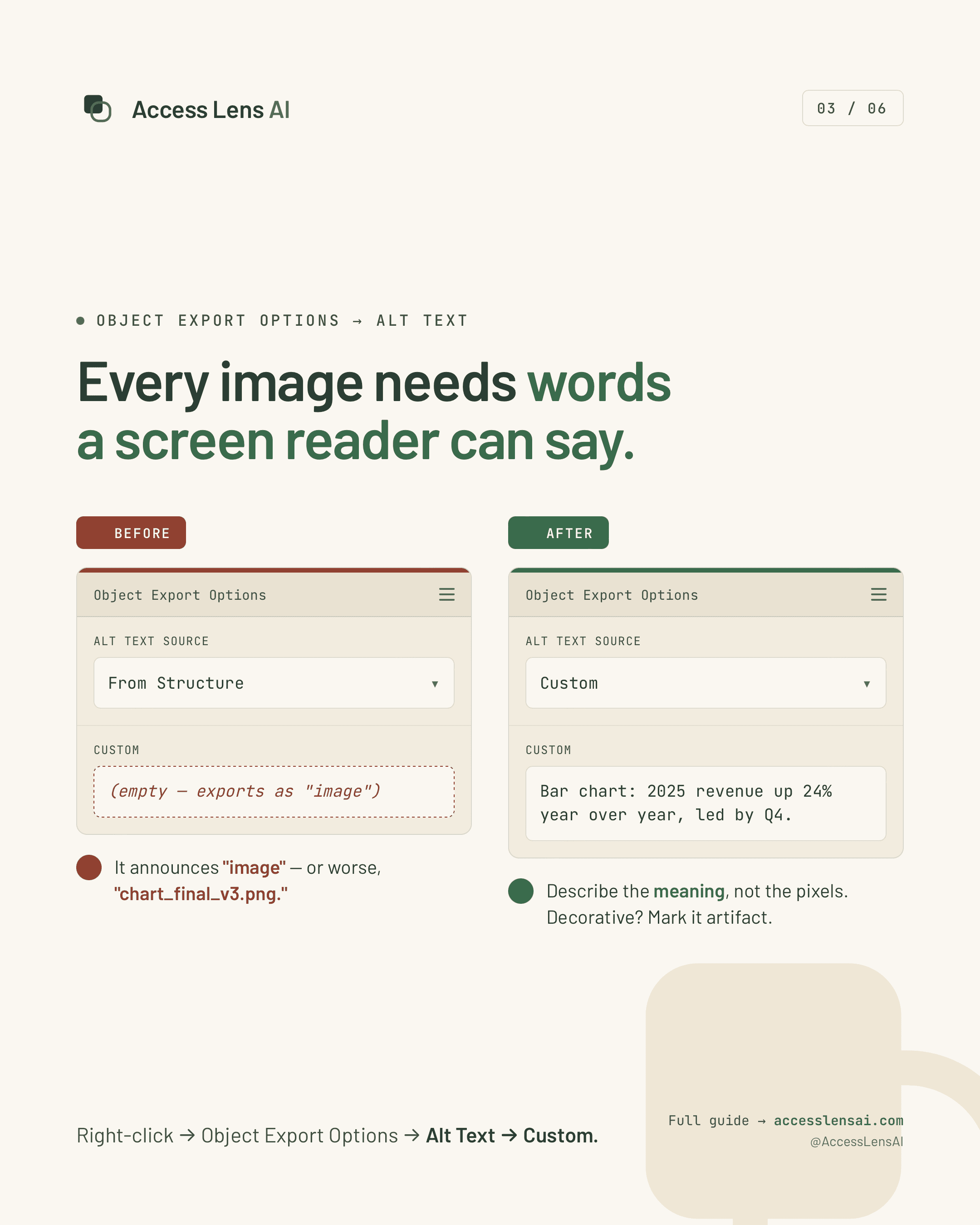
Before-and-after poster showing empty InDesign object alt text compared with custom alt text describing a revenue chart.

Custom alt text gives assistive technology the meaning of a graphic, not just its presence on the page.

Why it matters

A chart, diagram, or product image can become a filename or silent object when no description is provided.

What to check in InDesign

Right-click the object, open Object Export Options, choose Alt Text, and write a concise custom description.

Learn the fix

File Info / Title & Language

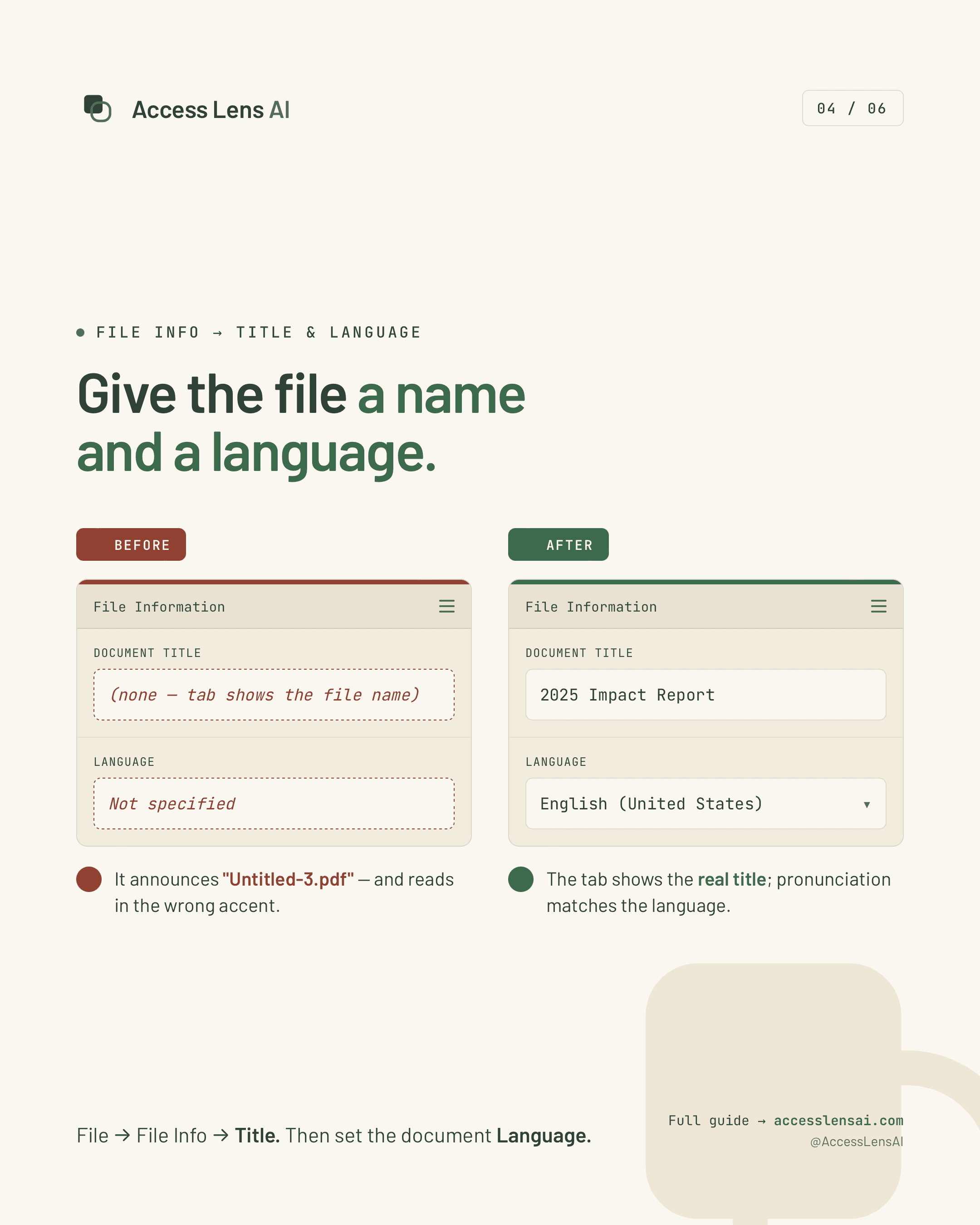
Give the document a name and language.

Before-and-after poster showing empty document title and unspecified language compared with a titled English document.

Title and language metadata help the PDF open with the right name and be pronounced with the right language rules.

Why it matters

Missing metadata can make the first thing someone hears an internal filename, followed by mispronounced content.

What to check in InDesign

Use File, File Info to set the title, then set the document language before the final PDF export.

Learn the fix

Anchored Objects / Reading Flow

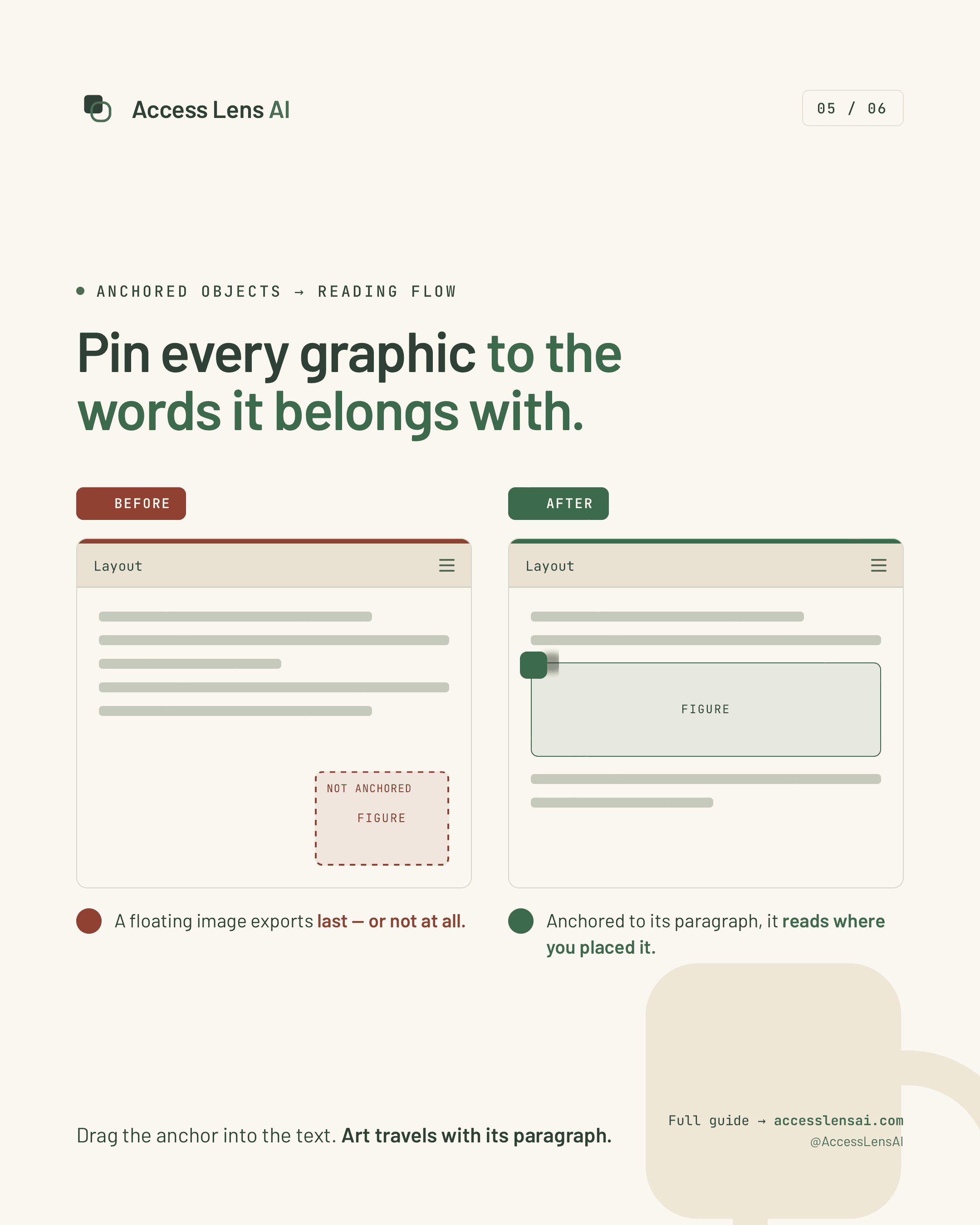
Pin graphics to the words they belong with.

Before-and-after poster showing an unanchored figure floating outside text compared with a figure anchored into the reading flow.

Anchored objects keep figures, icons, and diagrams connected to the text they support.

Why it matters

A floating graphic can be read late, out of context, or separated from the paragraph that explains it.

What to check in InDesign

Select each important graphic and place its anchor in the surrounding text where the object belongs.

Learn the fix

Tables / Header Rows

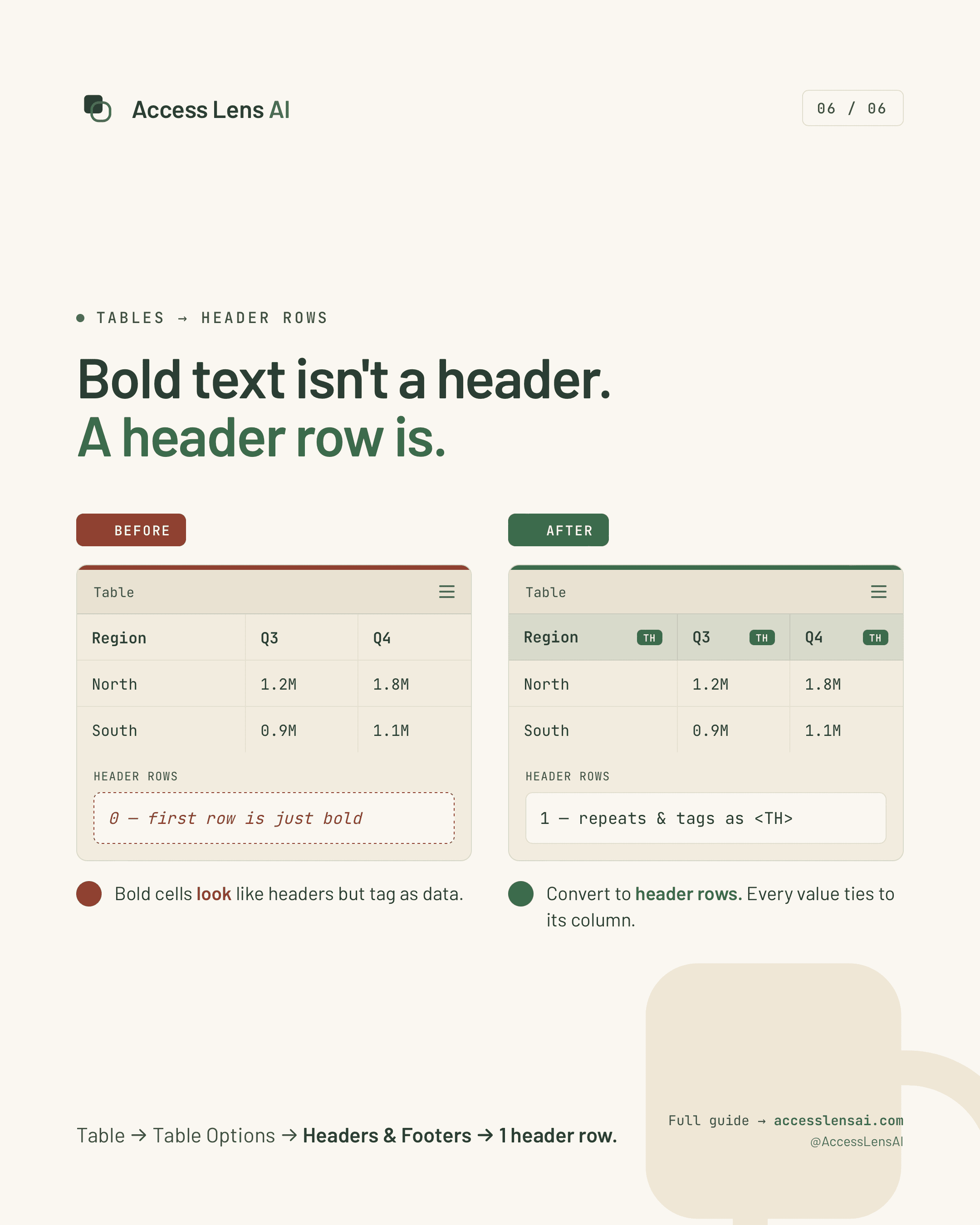
Bold text is not a table header.

Before-and-after poster showing a bold table row with no header setting compared with a true header row tagged as table headers.

Header rows preserve the relationship between labels and values when the table leaves InDesign.

Why it matters

Data loses meaning when values are announced without the column or row labels that define them.

What to check in InDesign

Use Table Options, Headers & Footers, or convert the top row to a true header row before exporting.

Learn the fix

Second collection

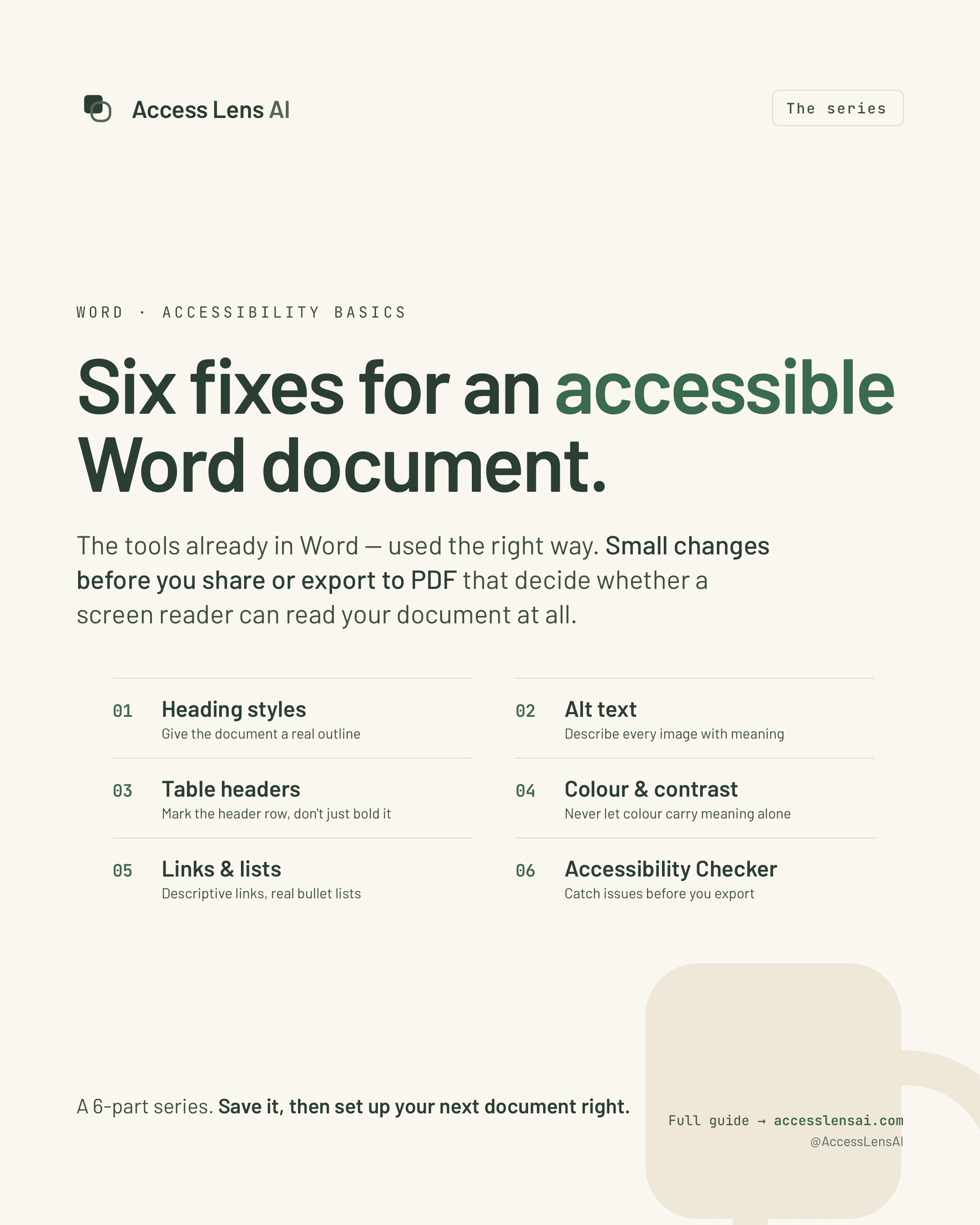
Word accessibility basics

Six practical fixes in Microsoft Word that improve document structure, image descriptions, tables, colour use, links, lists, and accessibility checks before sharing or exporting to PDF.

Heading Styles / Document Structure

Give the document a real outline.

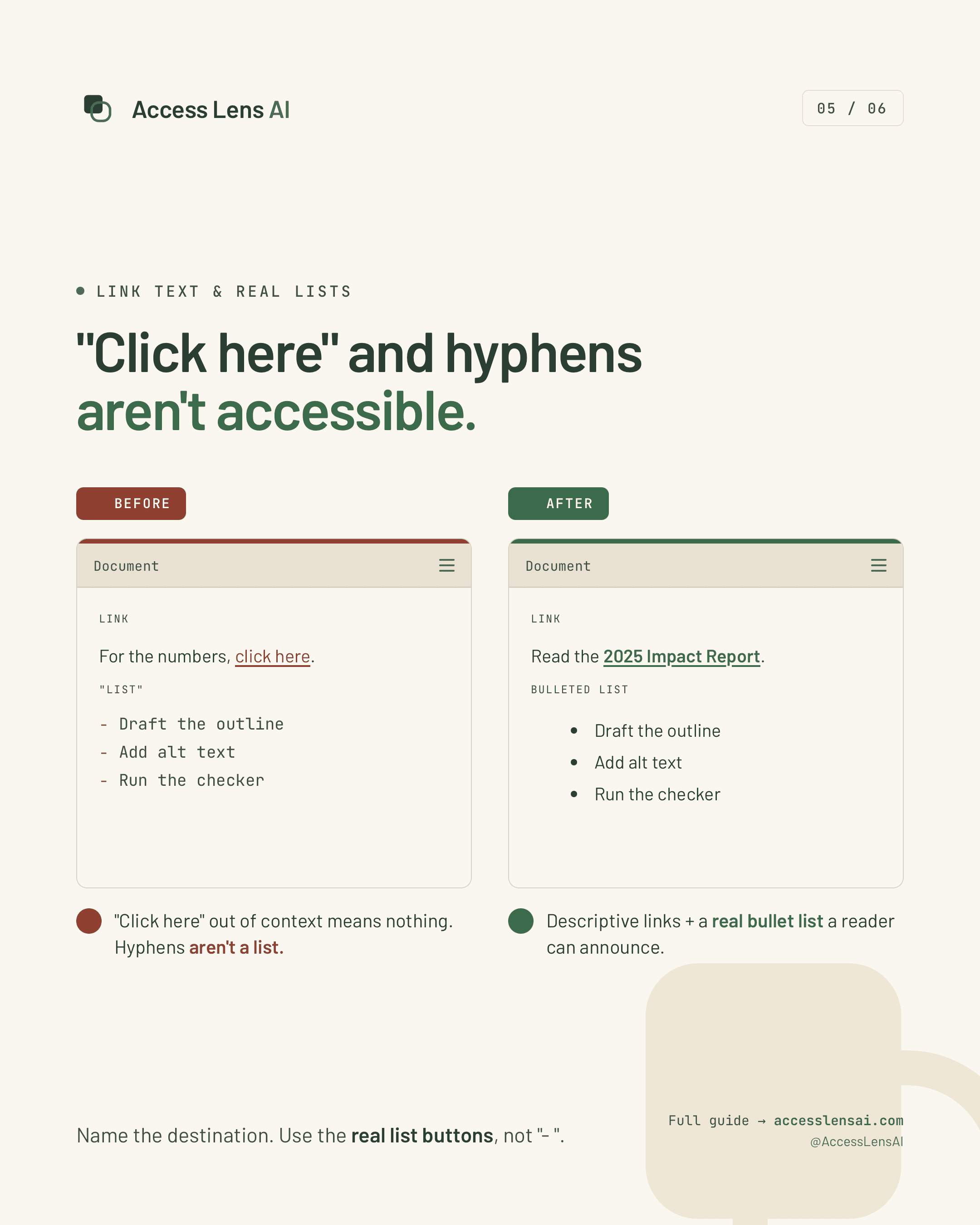
Word accessibility series cover listing six document accessibility fixes.

Word heading styles create a meaningful structure that can be used by screen readers, navigation tools, and exported PDFs.

Why it matters

Large or bold text may look like a heading visually, but assistive technology cannot identify its role unless a real heading style is applied.

What to check in Word

Open the Styles gallery, apply Heading 1 to the main title, use Heading 2 and Heading 3 in a logical hierarchy, and avoid skipping heading levels.

Learn the fix

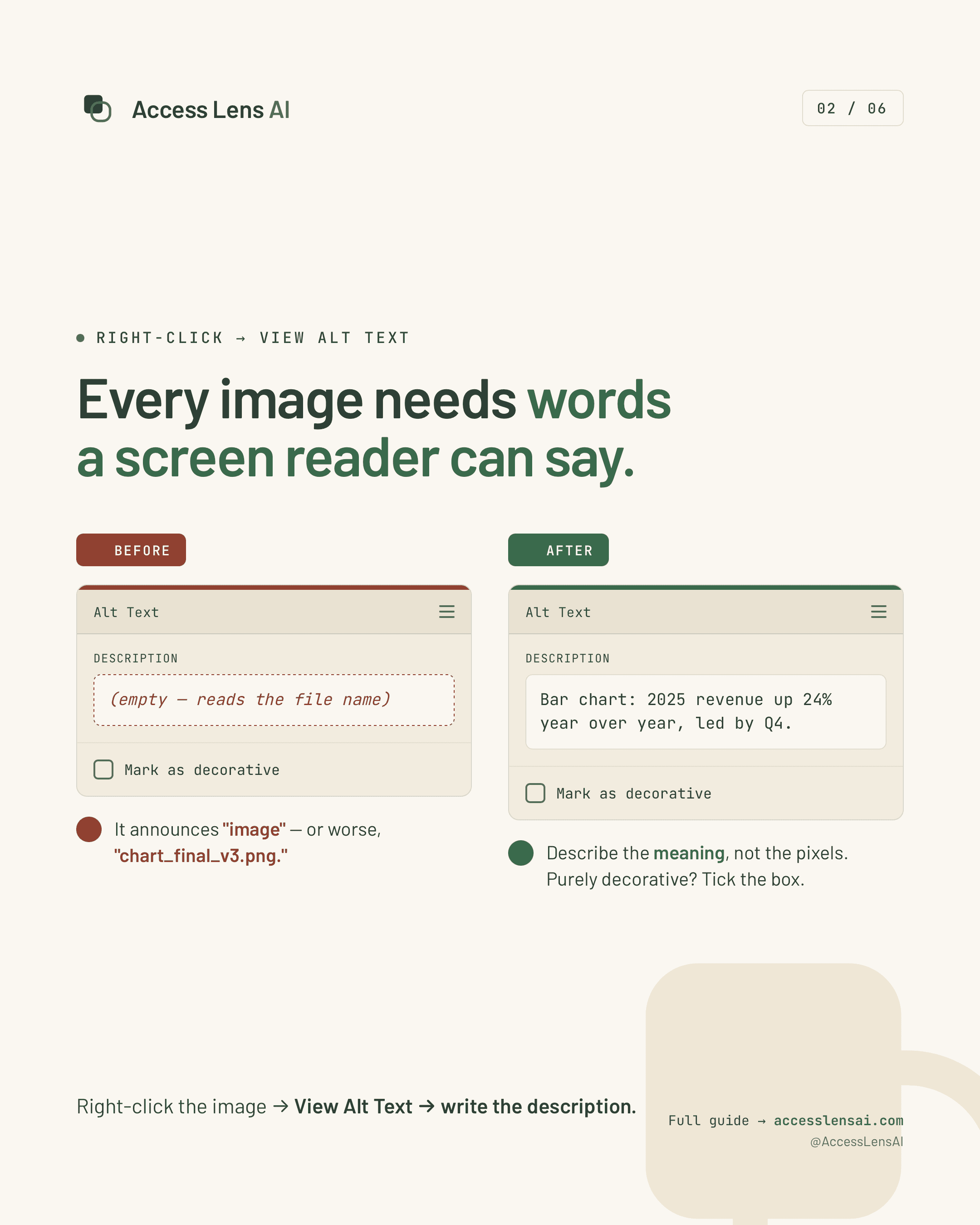
Alt Text / Image Description

Every meaningful image needs words.

Before-and-after comparison showing missing and useful alternative text in Microsoft Word.

Useful alternative text communicates the meaning or purpose of an image instead of merely identifying that an image exists.

Why it matters

Without a useful description, a screen-reader user may hear only “image,” a filename, or nothing at all.

What to check in Word

Right-click the image, choose View Alt Text, describe the information or purpose concisely, and mark purely decorative images as decorative.

Learn the fix

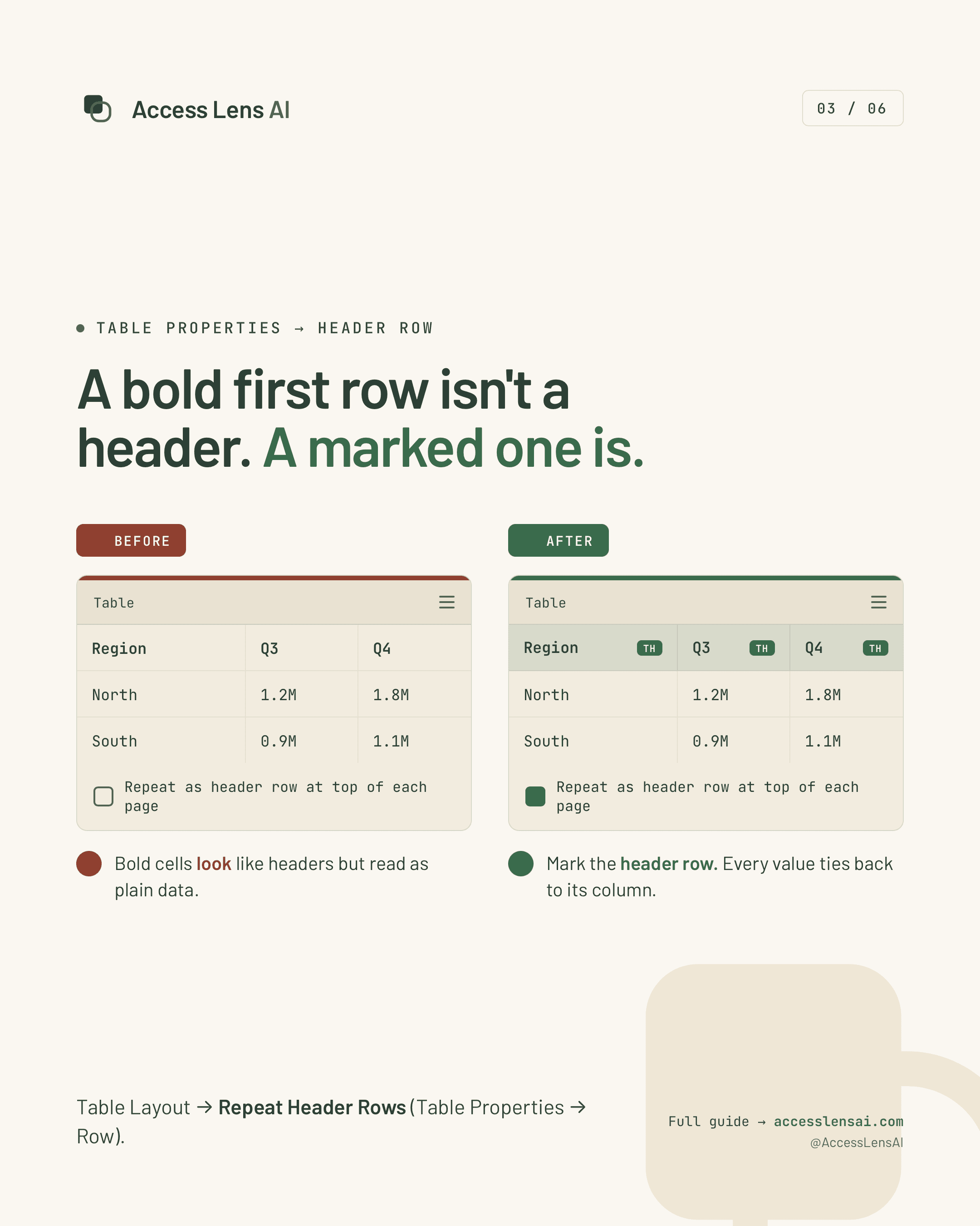
Table Properties / Header Row

Mark the first row as a real header.

Before-and-after comparison showing a visually bold table row versus a marked table header row.

Word table properties can identify header rows so each data cell remains connected to the correct column when read aloud.

Why it matters

Bold text alone does not create table-header relationships. Without those relationships, users may hear cell values without knowing what they represent.

What to check in Word

Select the first row, open Table Properties, enable Repeat as header row at the top of each page, and keep table structure simple and consistent.

Learn the fix

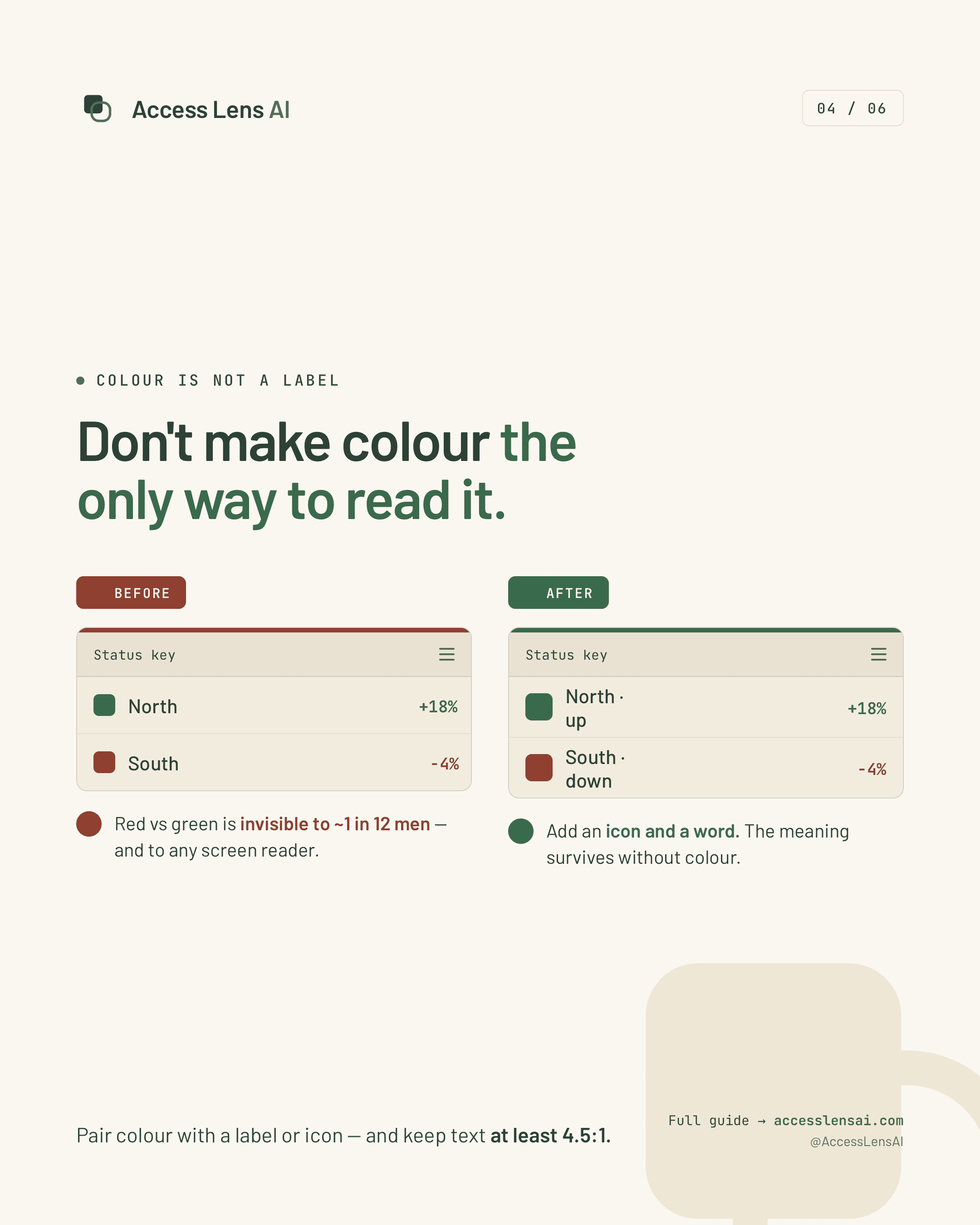
Colour / Contrast / Meaning

Do not let colour carry meaning alone.

Before-and-after comparison showing colour-only status indicators versus colour paired with written labels.

Pair colour with words, labels, shapes, or icons so information remains understandable without relying on colour perception.

Why it matters

Colour-only distinctions can be missed by people with colour-vision deficiencies and provide no meaning to screen-reader users.

What to check in Word

Add a written label or icon wherever colour indicates status, verify text contrast, and aim for at least a 4.5:1 contrast ratio for normal-sized text.

Learn the fix

Review / Check Accessibility

Find issues before you export.

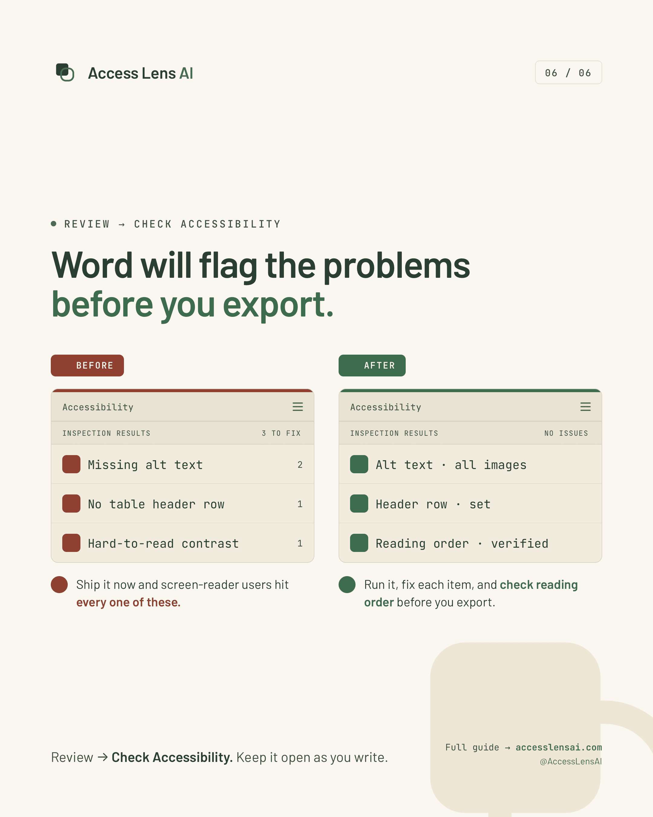
Before-and-after comparison showing Word Accessibility Checker issues before correction and no remaining issues afterward.

Word’s Accessibility Checker can identify common problems such as missing alt text, table issues, unclear reading order, and insufficient contrast.

Why it matters

Running the checker before delivery catches preventable issues, but automated results still require human review and judgment.

What to check in Word

Open Review, select Check Accessibility, fix each warning or error, inspect reading order and document structure, then run the checker again before export.

Learn the fix

Already have a PDF?

Run a screening to understand where accessibility risks may exist before remediation.

Run a PDF screening